Working with what stays
Keep lighting consistent during the digital comparison
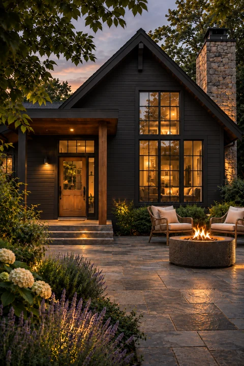
A daylight photo and a dusk photo are different starting points. Compare palette alternatives on one image before comparing across houses. Wet walls and paving can also change the scene's apparent depth and contrast.
Check the boundaries as well as the color
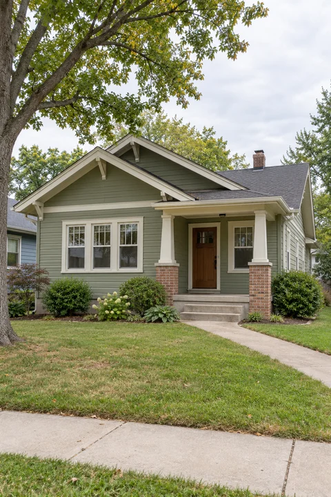
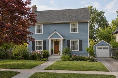
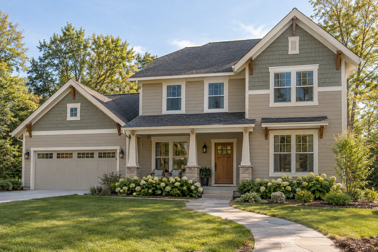
A useful preview should keep the roof, brick, glass and natural wood that you intend to preserve. Review those edges before treating the preview as a palette decision.
Use samples for the final decision
View physical samples beside the actual roof, masonry and wood, including both bright and shaded areas. Use the paint name, brand and code to identify the color being tested rather than trying to match a screenshot.