Sherwin-Williams · SW 6236
Grays Harbor on house exteriors
- Color family
- Deep blue-gray
- Digital swatch
- #596368
Where I’d start
Look at the blue-gray beside the warm roof. The color difference is easiest to see along that joint.
See Grays Harbor on more houses
Look at the color next to the roof, stone or wood you’d actually be keeping.
Harbor cottage
Clapboard, light trim and a natural wood door
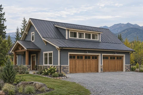
Open this houseMountain workshop
Dark metal roof and wood garage doors
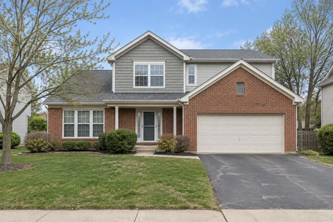
Open this housePorch cottage
A covered porch and a burgundy entry door
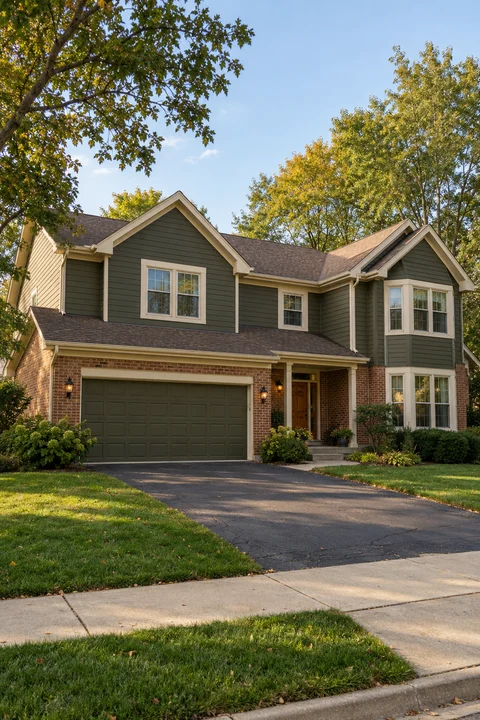
Open this houseSame house, three colors
Start at the edge where the siding meets an existing finish. Then step back and compare the whole facade.
Grays Harbor
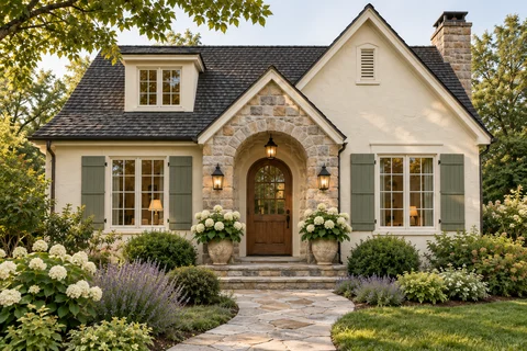
Sherwin-Williams · SW 6236Stucco beside an existing tile roof.
Naval
Sherwin-Williams · SW 6244Naval takes the wall further into dark blue.
Peppercorn
Sherwin-Williams · SW 7674Peppercorn gives you a more neutral charcoal reference against the same roof.
How we compared them. Recoat applied each named paint to the same prepared siding area of an illustrative demo photo. Each view uses the same framing and original finishes around the painted area.
Before you pick a sample
Choosing between shades?
Will Grays Harbor look blue or gray outside?
Look at it beside your roof and trim. A warmer material can make the blue more visible, while shade can make the wall read darker and quieter.
See Naval in its own guideBefore you buy a gallon
Three checks to make where you’ll actually paint.
Start with the hardest spot
Start where the siding meets the finish you’re keeping.
Compare generous samples
Set Grays Harbor and your closest alternative next to each other on separate sample boards.
Look in different light
Look from the sidewalk, then move the sample under the eaves to see the shaded version.